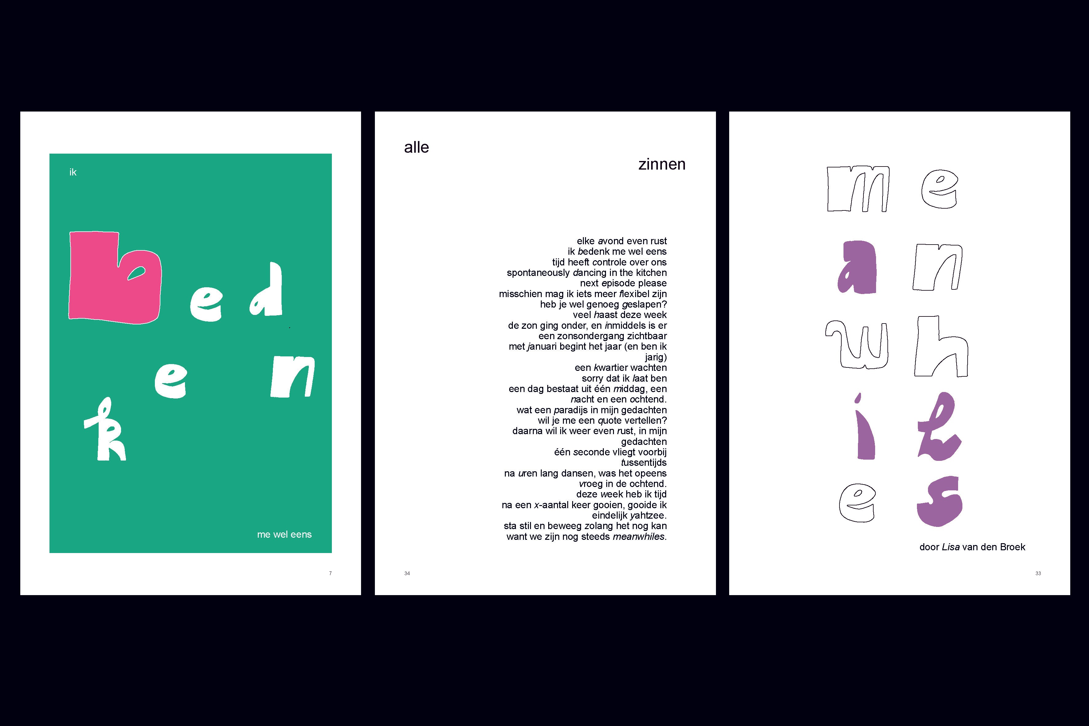

For the self-designed typeface Meanwhiles, I delved deep to discover who I am as a person. I explored the themes of sociability, playfulness, creative time flowing freely, and the creation of a typeface that incorporates my handwriting. The letter L is written in the way I naturally write it, while the letters f, k, o, q, x, and y each have a slightly rebellious character.
For this project, I designed a graphic novel, and you can see a few pages from it. The graphic novel includes all the letters of the alphabet — 26 sentences, sometimes words that each carry a meaning connected to how I live and what I value as a person.
_____
Voor het eigen ontworpen lettertype meanwhiles ben ik de diepte ingegaan om te ontdekken wie ik ben als persoon. Ik heb gespeeld met de termen sociaal, speels, creatieve tijd in vrije loop en het creëren van een lettertype waarin mijn handschrift zit verwerkt. De L is geschreven op een manier hoe ik de hoofdletter L zelf schrijf en de letters f, k, o, q, x en y zijn net eigenwijs.
Voor dit project heb ik een graphic novel ontworpen en je ziet een paar pagina's daaruit. In de graphic novel staan alle letters van het alfabet dus 26 zinnen en soms woorden verwerkt die ook weer een opvatting hebben die te maken hebben met hoe ik leef en wat ik belangrijk vind als mens.